
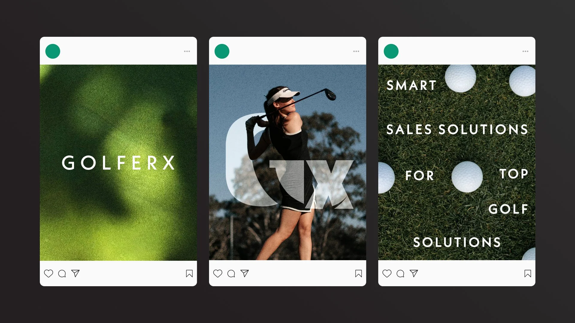
Golferx
Smart sales solutions for top golf retailers. GolferX is a technology company that specializing in AI solutions for golf retailers.
The platform integrates both in-store kiosks and e-commerce websites, allowing customers to receive tailored club suggestions by answering a few simple questions about their golfing habits and preferences. Designed to analyze this data and match it with the retailer's current inventory to provide immediate recommendations.
Timeline:
2021
Responsibilities:
Brand Identity Development
a note from the designer
I was brought on the team as a freelance designer to help create their brand identity. The project goal was create a modern and neutral logo to use across all channels, a short brand guideline and a presentation template for the team to pitch to investors. The only parameters I had to follow was to not including golf equipment graphics within the logo. We wanted it to be less intimidating and appeal to all golfers no matter their skill level.
The logo centers around the ‘G’ and ‘X’ working together simultaneously. The negative space of the ‘G’ represents a golf swing speed meter. The tail of the mete extended into the ‘X’ merging the two letters together.


The Data’s on Par (and Then Some)
Retailers using GolferX are seeing significant results: a 30% boost in sales, a 40% drop in returns, and a 30% month-over-month increase in same-store sales. With over 55,000 fittings completed and more than 600,000 data points captured, GolferX is proving its value by connecting customers with the right products more effectively than ever.
My design process |
My design process |
-
![]()
- 01 Discover
-
![]()
- 02 Design
-
![]()
- 03 Refine
-
![]()
- 04 Deliver


Let’s rewind
Before becoming an AI company, GolferX started as an app with the goal of becoming the world’s largest golf community, think a blend of Instagram and Reddit. Previously, their mission was: “We aim to amplify the enjoyment of golf through social media and gamification.” Today, that mission has shifted to “Smart sales solutions for top golf retailers.” That said, while the brand concept and mission have evolved, the logo has remained consistent, adaptable, and user-friendly throughout the years.
My process consists of four phases: discover, design, refine, and deliver. Within these phases, I began defining and understanding the brand’s purpose and target demographic. From there I moved on to sketching, exploring various concepts, designing initial ideas and getting both good and bad (but mostly bad) concepts out on paper. At the same time, I’m researching other golf brands and gathering inspiration for fonts, color palettes, even exploring concepts the client initially wanted to avoid. This process played a huge role in the success of this project. Without going through each phase thoughtfully and making impactful decisions along the way, the logo might not have evolved alongside the brand.
-
The client didn’t want any golf-related icons, and he also didn’t want the logo to look too techy. They we’re looking for something simple, modern, and easy to recognize. In the examples they provided, there was a strong use of boxy, condensed sans-serifs and some exploration with letterforms. They had already done some initial exploration on their own before I joined the team, and they had a clear sense of what they didn’t want.
In my moodboard, I was inspired by brands that feature an icon and a strong typographic wordmark. I was drawn to logos with hidden meanings that, once you notice them, you can't unsee. Like the arrow in FedEx, the combination of an “A” and a location pin in Airbnb, or the Beats logo that resembles headphones on someone’s head.
-
In Round 1, I explored the letter “G” and how I could subtly incorporate golf elements. In one concept, I added small circles to the inner bowl of the “G” to represent a golf swing. For another concept, I used a script font paired with a rounded sans serif to mimic the feel of a golf course, placing a circle on top of the ear of the “G” to suggest a ball sitting on a tee. The last concept was an extension of the second idea, but this time I started explored a stronger, sharper typeface, called Kabel.
After presenting all the concepts, the client gravitated toward the first logo, which had subtle hints of a swing meter. While it wasn’t quite finalized, they saw the potential. For next steps they asked for 1-2 additional options, one where the ‘G’ and ‘X’ worked together, and another featuring just the ‘X’. The client also wasn’t a fan of the original teal and yellow color palette, preferring instead the softer cream and teal colors from the other concept presented.
-
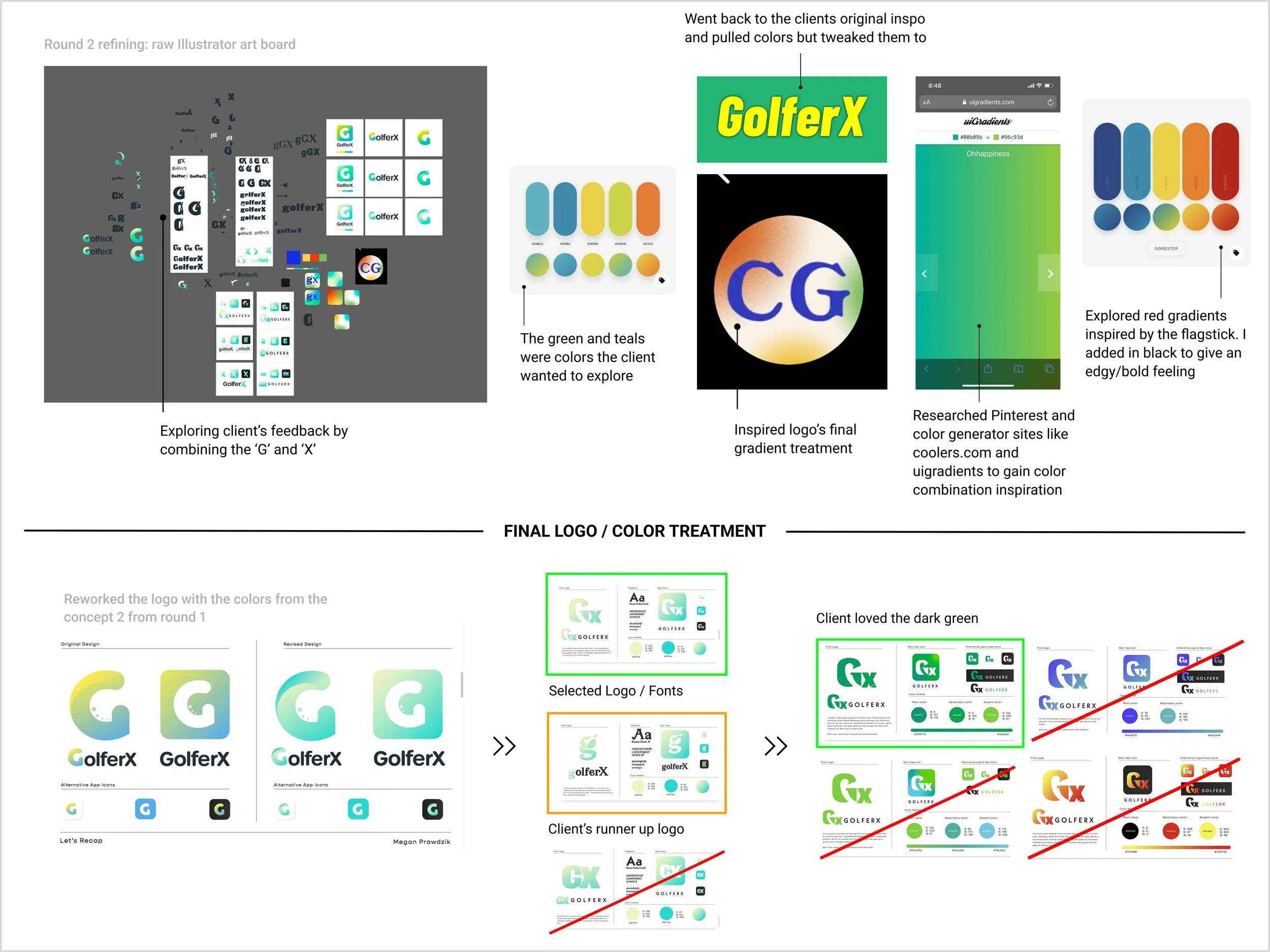
For Round 2, I took the client's feedback and dove headfirst into applying their critiques. My first step was to switch out the color palette and apply it to the selected logo from the first round. As I worked through this round of design, I realized that the small circles in the “G” wouldn’t scale well. So, I created a new version of the swing meter using the font Kabel. Things started to come together, as the font gave the illusion of speed and captured the strong, powerful impact of a golf swing.
After exploring various sans serifs and a few serifs, I ultimately landed on Kabel because of its flexibility. It’s versatile across different platforms, offers a wide range of font weights, and maintains strong legibility thanks to its bold, sharp forms. This makes it especially user-friendly. After testing multiple logo renditions, exploring both letters separately and together, the client chose the version that truly brought their vision to life. The next step was to fine-tune the color palette and deliver the final spec sheets and logo files.
-
The client originally provided a few colors they wanted me to explore, including a brighter green, yellow, and teal. While designing, I kept this color scheme in mind but also explored options on the opposite side of the color wheel. Ultimately, we landed on a monochromatic green palette. For the final logo, we chose the darker green as the brand’s primary color.
The final concept focuses on the ‘G’ and ‘X’ working together simultaneously. The negative space in the ‘G’ represents a golf swing speed meter, and the tail of the meter extends into the ‘X,’ merging the two letters into a unified mark.